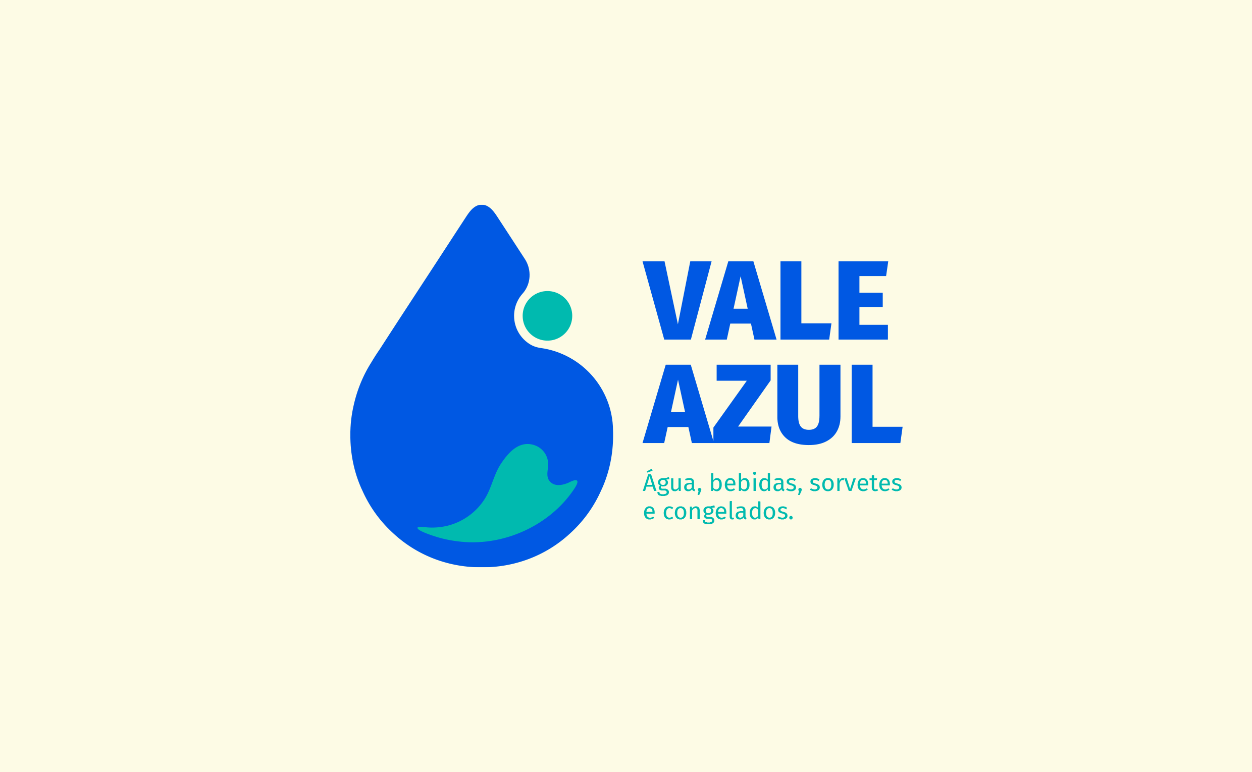
VALE AZUL
Visual identity project developed for a neighborhood water retail store that also offers beverages, ice cream, frozen foods, and charcoal. The goal was to create a clear, trustworthy, and easily recognizable visual system at the point of sale, reinforcing the brand’s specialization while reflecting its everyday presence in the local community.
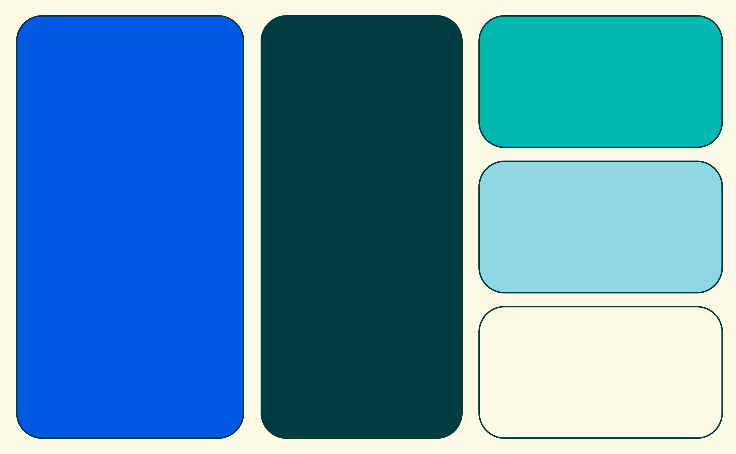
The identity was built around a clean, geometric visual language, prioritizing legibility, simplicity, and practical application across different materials. The color palette uses shades of blue and green inspired by the sea, conveying purity, freshness, and reliability, supported by a neutral gray to maintain visual balance.
The central symbol is a stylized water drop that incorporates references to the founders’ initials along with a subtle wave shape, reinforcing the direct association with water and supply. A medium-weight sans-serif typeface supports a clear and straightforward tone of communication.
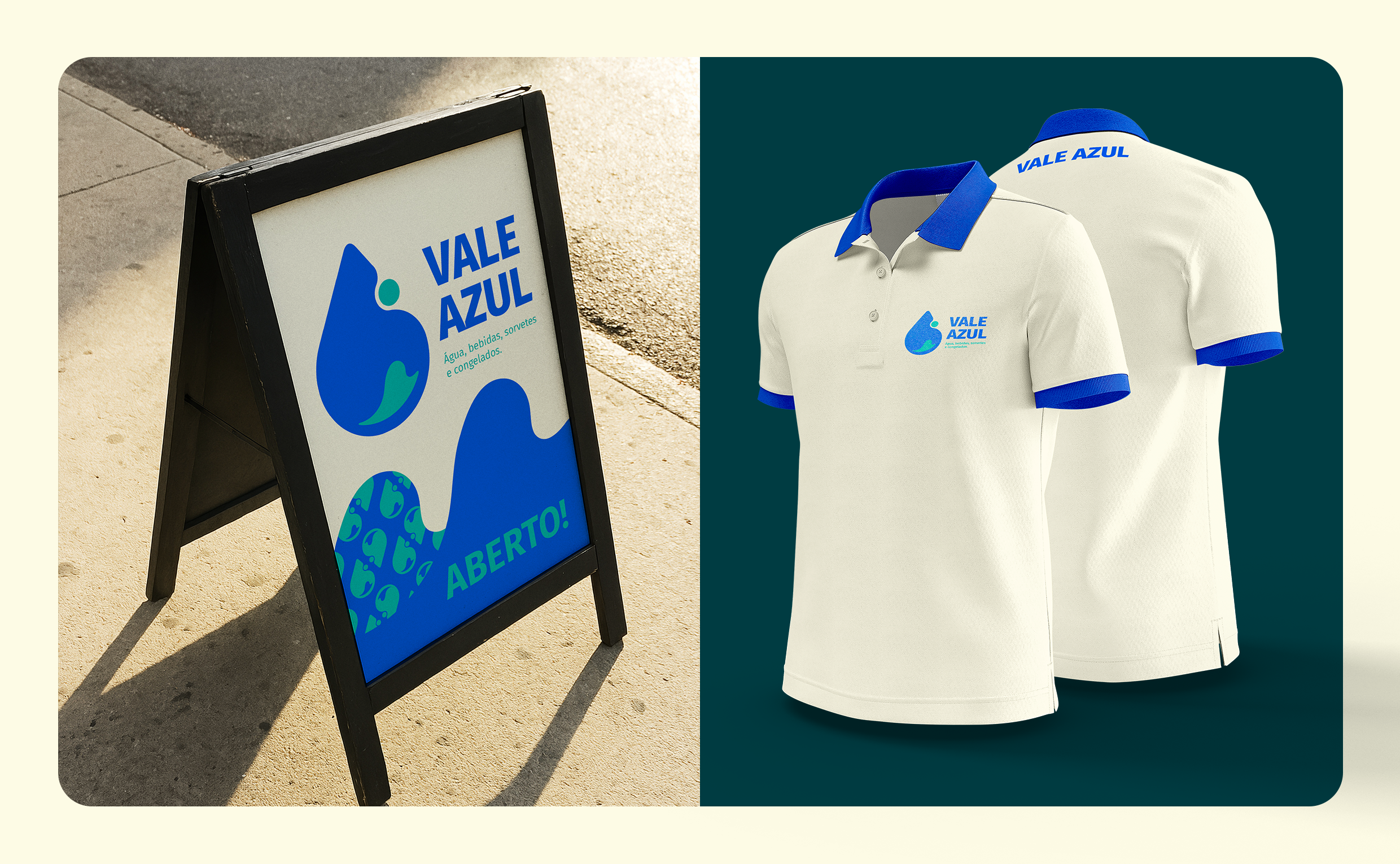
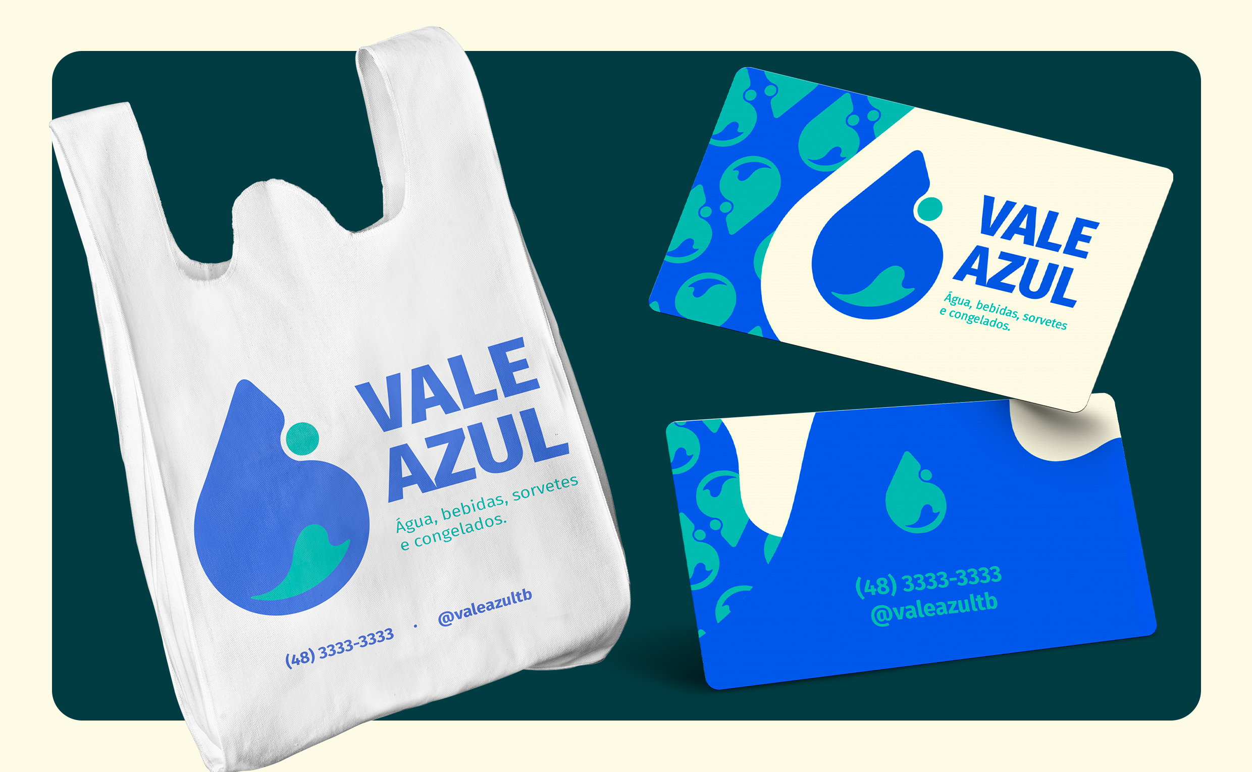
The project included the development of multiple logo versions, color palette definition, typography selection, and brand usage guidelines, along with core materials such as storefront signage, uniforms, stickers, business cards, and social media templates. The result is a functional and consistent visual system designed to support the brand across both physical and digital touchpoints.