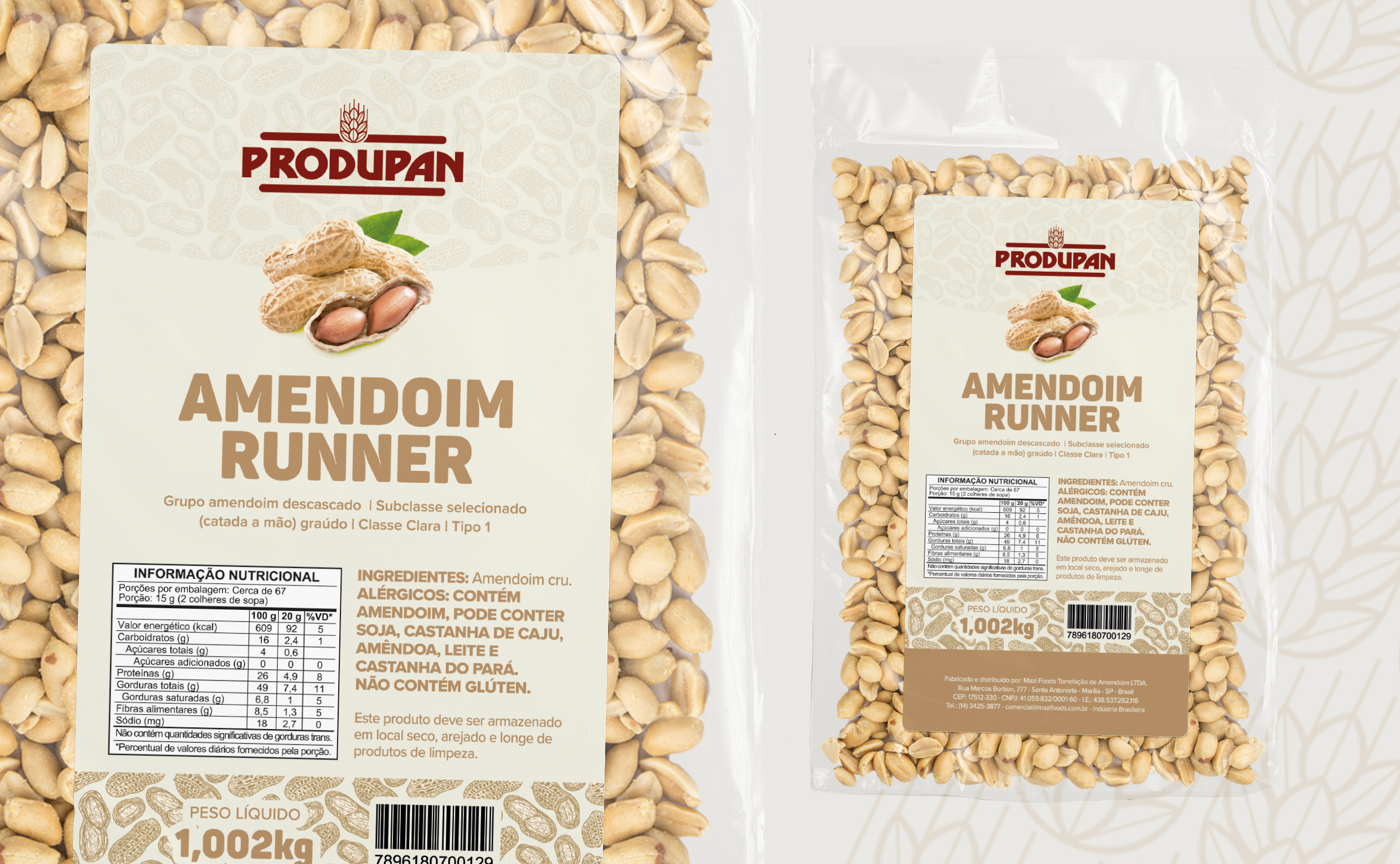
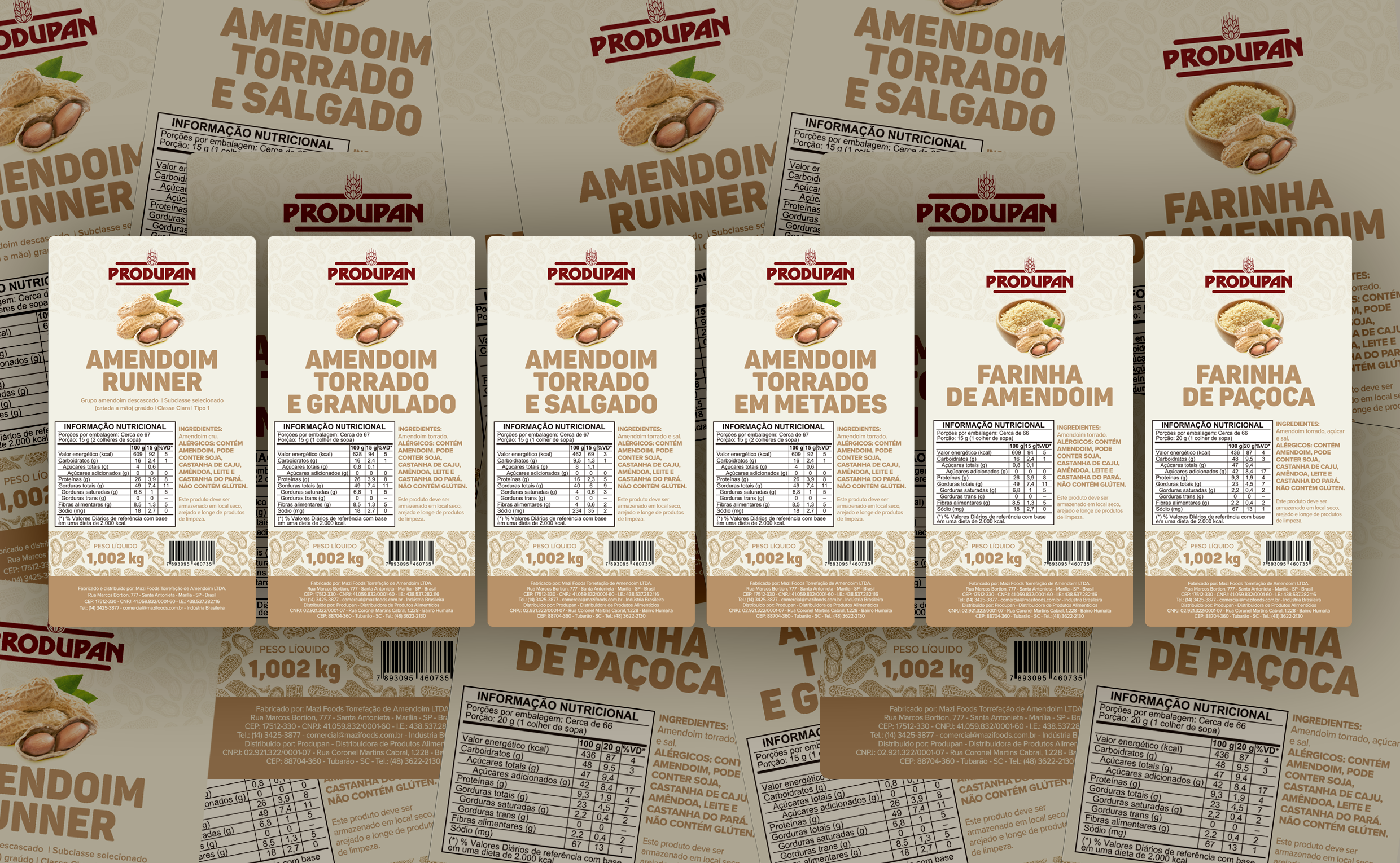
PRODUPAN
Label design for Produpan’s peanut product line, focused on visual clarity, product standardization, and strong shelf presence. The project aimed to create a simple and organized graphic language capable of quickly communicating the product type and its variations while maintaining consistency across different flavors and formats in the line.
The composition prioritizes clear typographic hierarchy, neutral colors associated with natural foods, and visual elements that highlight the core product. The result is a functional label that is easy to read and replicate, strengthening the brand’s identity while helping consumers quickly identify the products on the shelf.